
Articles & Strategies
Why support and resistance is still relevant
Much has been written about the traditional concept of horizontal support and resistance. It is basic knowledge when it comes to trading the financial markets and has long been in all the books about technical analysis. Nowadays some say it is outdated and should be replaced with more advanced techniques or indicators. Continue reading to see why it still matters and how you can apply it to Price Action Trading across all markets.
Support and Resistance is an Area – not an exact line
The first myth about horizontal support or resistance is, that it is just a line at which the price starts to turn or falls through. As you can see in the image below it is better described as an area where price reacts in some kind. This comes down to how a price is formed and what happens in an order book. I will cover this complex topic of an order book and how a price is formed in a more detailed post.
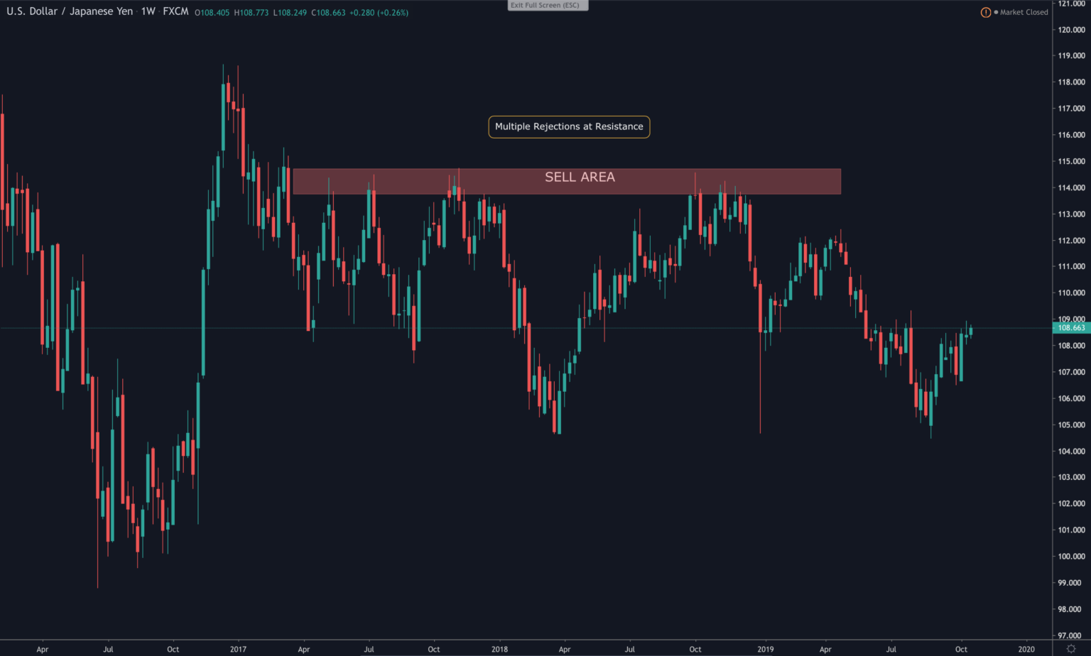
When looking at those areas of horizontal support and resistance we notice, that the price mostly reacts in two ways:
- Price goes into S/R with a lot of momentum and gets rejected nearly as fast or even with greater momentum.
- Price tickles its way into the S/R with a more corrective move, which typically takes longer and doesn’t look as significant.
Sharp Reversal
When looking at the picture below we can spot that the market started to fall to support sharply and was rejected at the zone. The rejection can happen with a simple touch, resulting in only a single candle. This is mostly a Pinbar signal which will be formed and is still one of the most reliable candlesticks to trade.
What you should consider, is, that every market participant has different time horizons and goals for his trading. (Except making money ;))
So what is a single touch for you, resulting in a nice Pinbar in your timeframe could be a completely different kind of pattern in another timeframe. Therefore resulting in a different interpretation of another participant.
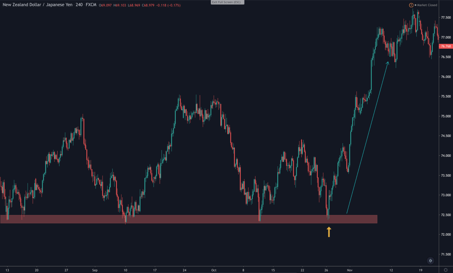
When trading forex, stocks, cryptocurrency or any other instrument like ETFs you should always consider the other market participants.
Apart from the fast rejection, exists the slow corrective retest, which will be dicussed below.
Corrective Retest
The second way happens mostly over a longer period of time. This is a nice indication because it tells us, that the smart money in the market is stacking up its positions for the next major moves. Which often could give the direction of the trend for weeks or months. Smart money are the big banks, hedge funds or proprietary traders, the so called professionals in the market. Their positions move the market and it is in your best interest to ride the waves they are making.
As you can see in the following chart, at the marked area price stalled for several sessions, having no clear direction. Over this period of time, the professionals closed their positions, took profit and added new ones in the opposite direction.
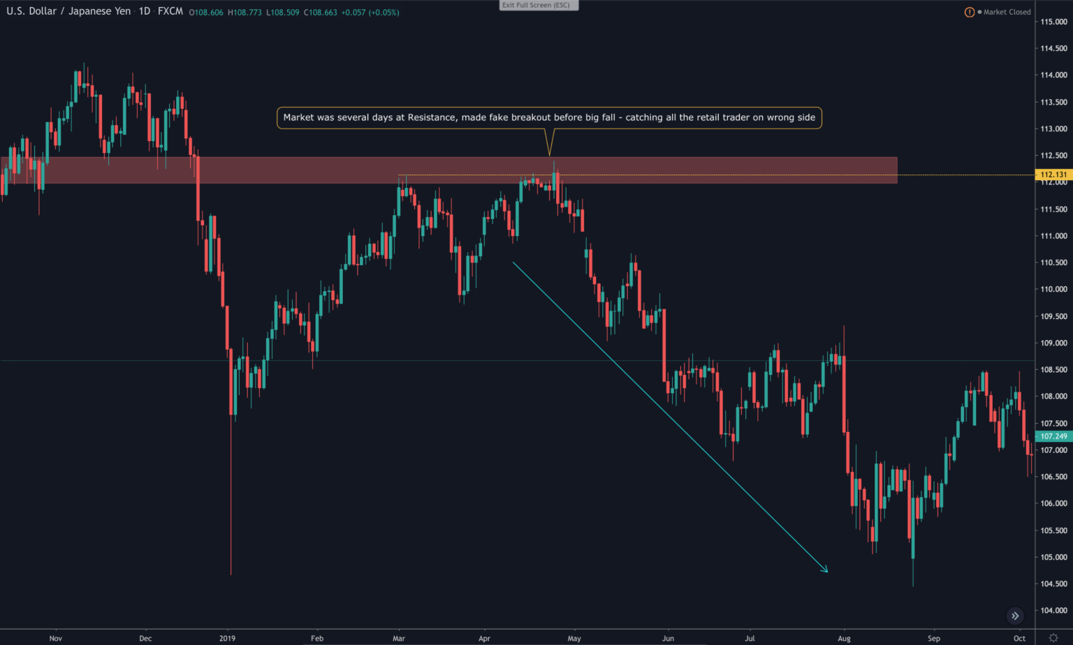
The last high marked with the dotted orange line, was the exact last high. It was tested for some days and then broke to the upside in intraday, tricking all the retail traders into believing the market is bullish. But in fact it was just a classic fake breakout or Fakeout pattern played by the smart money.
Keep in mind, that most organisations are cooperate institutes, which have guidelines, rules to follow and boards for reporting and approving. They are sometimes slow and think in a longer timeframe than the common daytrader. But as you maybe already know, the big profits in the market are not made in intraday trading. Hoping into and out of trades only adds to your stress level and reduces the likelihood of success. You also have to make up the spread, which can add up!
Timeframe matters
When identifying important support and resistance areas in your price action guided trading, do it in a top down manner. This means you want to do a multi timeframe analysis of your market. Starting at the higher timeframe, let’s say the monthly or weekly timeframe, gives you a broader view of the market and where it is right now.
After marking the important areas on the weekly timeframe, the most common used and important timeframe is the daily. You have probably read this on other blogs before. And it is true!
The daily timeframe is the most important because it represents the whole movement of a working day with it’s high, low, open and closing price. Therefore you want to adjust your weekly drawn zones to a more accurate level on the daily chart.
The daily chart should be your point of interest when considering a trade. The actual entry timeframe for my kind of trading is a strong signal on the 1 hour or 4 hour chart. Because trading is all about Risk to reward, a better Stop loss can be achieved when acting on the 1 or 4 hour chart. But for your general analysis of the market the higher timeframe gives you the direction.
Avoid small timeframes
Drawing horizontal S/R at smaller timeframe often leads to false assumptions. Just because you have spotted a zone on the 5min chart which has been respected several times in the recent session, doesn’t mean it will act as a reliable zone for the big guys.
In fact, the opposite is often true. The smart money knows, that the small trader often acts on small timeframes and places his stops accordingly. This will happen in fake breakout (aka Fakeouts), where the Stops will be triggered. This gives the smart money the necessary liquidity and kicks the private trader out of the market with a loss. Just have a closer look at the last chart to see a real example.
Support becomes Resistance and vice versa
An important characteristic of support and resistance zones is, that they often switch their nature over time. As you can see in the following chart, the market broke through support, retested it before falling another 600 pips. After a new low was established, the price shot higher, without any real rejection at the resistance.
Making a new high, what indicates that a trend change is going to come. After that it moved in a three wave corrective fashion back to the zone, which now turned into support. It got rejected and price continued to rise for the next months, making over 1000 pips.
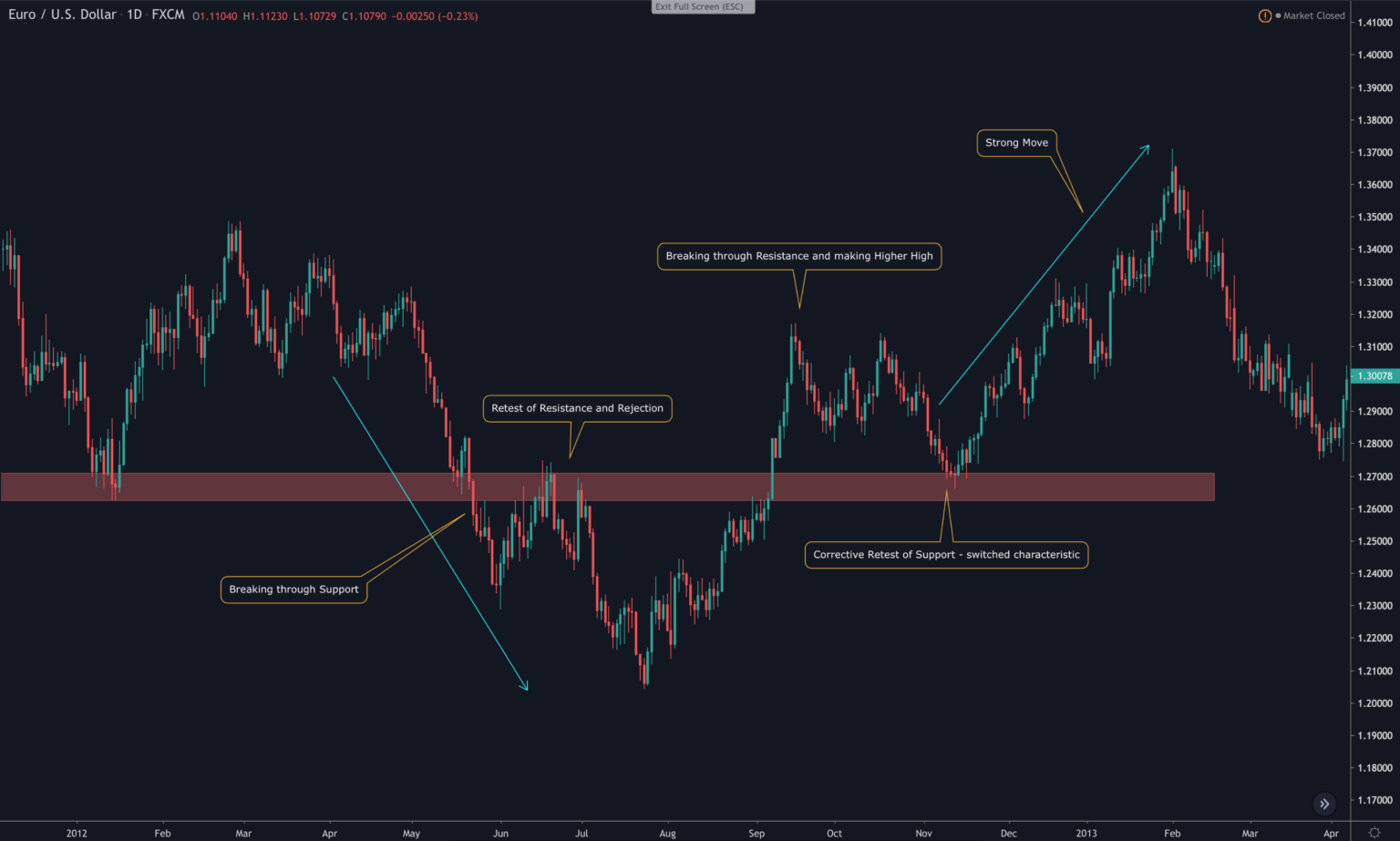
You can spot this behavior all the time in the market. Remember the market does not move in strict lines but more in waves and repetitive pattern, which represent the global mass behavior and the psychology involved.
Conclusion
Always do your analysis of a market top to bottom. Start with the monthly/weekly timeframe and then switch to the daily chart. Draw the important support and resistance zones and watch how the price is reaction at this level. Stay patient and watch for a clear signal before entering the market and keep the other market participants in mind. Don’t use S/R at smaller timeframes, it will just lead you the false assumptions about their significance.